“And if you don’t expect too much from me
You might not be let down”
Hey Jealousy, The Gin Blossoms
With all the excitement around Web3, there is one thorny, recurring issue that keeps coming up, and it has generally either held back its growth, or required Web2-like work arounds to make it possible:
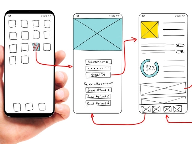
1. It has horrible user interfaces and user flows
Let me share a quick story. I sat down with one of my friends, who is a very successful technology executive, and we started doing some LP staking at various DEXs and also some lending and then provided liquidity to some more exotic projects. We used two different L1s (eth and solana). To do this, he set up a metamask and phantom wallet, secured his seed phrases, and started transferring ETH and SOL to his wallets, and then started purchasing tokens and then staking. When we were done, he said, “I have no idea what I just did.”
Perhaps I was a bad instructor, but also, it was quite complicated. His wallets kept popping up asking for authorization and he by default clicked yes, not really understanding what was going on and how the various registries were being updated and what he was signing over/receiving. Plus, having two user interfaces (the site and the wallet) and moving from CEXs to DEXs also proved challenging. In short, it was a lot. It was a lot to understand what was happening and what was being received and why.
And this is a huge problem within Web3. We have gotten used to unbelievably slick and friendly user interfaces and user flows in Web2 — so much so that there are paradigms that we understand and a whole class of products that we can “just use.” This is the mark of a good product — and a mark of the success of Web2 is that there is almost never “Instructions.” Instead, we learn by doing and by onboarding. We click and hit the back button and figure out the information organization and the user interfaces of the product that we are using. Over time, we see similar user interfaces used across products: sign ups, user account registrations, location of menus, reports, etc. All of this is fantastic.
But, Web3 is to a large extent, just more complicated. Instead of having username/passwords with recovery (which we are all used to), we have a seed phrase that goes into a wallet, which we cannot lose or have compromised. Instead of having a transaction (like buying something), we have to connect a wallet and then authorize transactions. And, sometimes, it’s even more complicated if we are trying out a new L2 or something similar. Plus, there are multiple places this can break, and we have huge gas fees depending on the L1 (such as with ETH), which we have to also approve.
Some sites, like Coinbase, abstract all of this by holding onto the keys and providing a security system on top of Web3 with a more Web2-like interface. This can be a huge win for many users, because it allows them to participate, in some way, in the Web3 ecosystem with the comfort of Web2. In fact, this is what Concert has done to a large extent. We have created a familiar interface, allowing users to experience Web3 benefits, without having to maintain separate wallets, seed phrases, and other complications and user hostile interfaces. This has allowed Concert to develop enterprise controls (projects, collaborators, passwords, billing, etc.) which are in-line with existing paradigms and use cases.
We hope you enjoy it! And, watch out for more to come as Web3 improves, especially with performance, cost and user interfaces!


